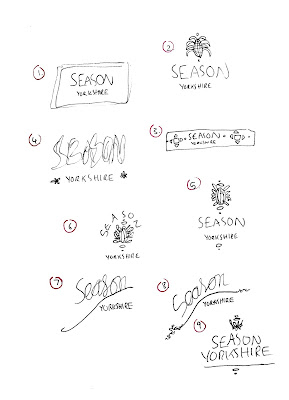
Main points to consider for the Logo:
- Play around with the sizing of the 'Yorkshire' in 'Season Yorkshire'.
- Play around with the current colour palette used as it represents the colours of the spices. Start off purely black and white and then develop the chosen logo using the colours.
- Add a hint of Pakistani/Middle eastern culture within the logo somewhere, as that is where the spice recipes and cook book are based on, but an overall modern aesthetic. Use details from the print that she had created herself.
- Sans Serif typeface as it is more modern, the inspiration Arooj also sent through mainly consisted of minimal Sans Serif typefaces.
 |
| Initial Ideas |
Using these initial ideas, I then started to create some designs for the Logo on Illustrator.
The illustrations/patterns below are details picked out from the print that Arooj provided which she had created herself. She mentioned that she wanted some details of it within the logo, which is good because the full print was very complicated and wouldn't be appropriate for a logo. I picked out shapes and illustrative parts from the print which I found interesting which also reflect the middle eastern, minimal vibe that she is wanting.
Further developed Logos:
 |
| Details picked out from original print |
Further developed Logos:
 |
| Trying out different Sans Serif typefaces |
I then started to incorporate the patterns and details with the text. When considering layout and shapes, I also looked back at the inspiration and current competition. The overall aesthetic for the Logo aims to be modern and minimal, with a hint of middle eastern culture with the detailing.


No comments:
Post a Comment