Saturday, 29 June 2019

Everything Goes Soirée- Designs

The 'Everything Goes Soirée' is an end of summer party that me and my family are throwing at the start of September. The theme 'Everything Goes' means that the guests can dress up in any fancy dress they like or even mix several themes together , bring any food and drinks they like, and any entertainment, everything goes!

The party required a poster/flyer which would be sent out to family and friends that don't use Facebook (as they aren't be able to see the event page), the poster up will also be up at the party in a larger scale. Furthermore, the Facebook event also needed a banner photo which uses the same design.

The poster/flyer must include all the key information:

  • Date
  • Time
  • Address
  • Name of the party
  • Small description 'Food, music, fun, party tricks, dressing up, anything you want... everything goes!'
I started with looking at some event posters which I found interesting and relevant. I liked the first two posters below because of the way they use a main piece of imagery to dominate most of the page, with the information at the bottom quarter. I also found the use of bold colours really eye-catching which relates well with party events, poster number 3 also uses an interesting limited colour palette which I enjoyed.

Furthermore, Poster 3 and 4 were my favourites due to their funky and fresh aesthetic. I particularly loved the image used in Poster 4. Poster 3 is also successful as it clearly communicates that it is for a summer festival through using appropriate imagery.

For my poster, I considered layout of the text and imagery in similar ways to these 4 posters, as well as using one strong piece of imagery to dominate most of the page and give the overall poster a funky, eye-catching aesthetic.


Poster 3

Poster 4


Below shows the initial designs which I created for the poster. For the image, I created a collage which relates to summer through collaging a selection of random summer images together, the randomness relates with the 'Everything Goes' theme. I also love collage as a technique as it gives everything a fun, quirky feel.

Below shows the main initial designs. I felt that a Sans Serif typeface was most appropriate so that all of the information is legible as the main aim is to provide the key information about the party, with the image being the main focus. Furthermore, I felt that the design which used the typeface Impact was more successful as it looks more eye catching and poster appropriate.


The design below experiments with scale of the image, as I felt that the yellow background wasn't really working and I wanted the overall poster to look busier.


The designs were then developed through experimenting further with colour, scale and layout. Below shows a few colour variations, I wanted the colours to represent summer and fun so I focused on brights and neons.


The final poster uses the collaged image in two different scales and colour in order to look more experimental and exciting, a busier and bolder design is more appropriate for a party event as it is more upbeat. I also chose this colour palette as most of my friends and family liked it is most, I agreed. Furthermore, the key information is in a larger, bolder text with the other information alongside it in smaller scales to fit the page layout and imagery.

Final Poster
Section of the poster used for the Facebook event page banner:

iPhone

Laptop

Saturday, 22 June 2019

Final Logo and Business Cards for Season Yorkshire

Saturday 22nd June

Season Yorkshire have now decided on the logo they would like to take forward as the final design which will be used on all their branding and social media. The pattern in the 'A' in 'Season' is taken from a middle eastern print which was created by Arooj (one of the Season Yorkshire managers), relating to where the Season Yorkshire spices originate from. Additionally, the Sans Serif typeface aims to give the overall logo a modern and contemporary aesthetic, drawing most of the attention to the 'A'.


Final Logo

Furthermore, below shows developed business card design which use the final logo, these designs were developed through taking on board further feedback. They mentioned that the back should be one simple shape taken from the print instead of a repeated pattern. The front uses the logo, contact information and the Season Yorkshire shop URL.


Since the final logo has been decided and the business cards have been developed further, I was able to start adding some colour. When discussing colours palettes with Arooj, she mentioned a few spice company colour palettes that she thought worked well (images below, @spicebox and Dishoom). 


Furthermore, we also discussed that we felt warm, rich colours would work best to represent the middle eastern aesthetic that is needed to be achieved, rich colours also look classier. Additionally, the paler yellow and green shades represent the colour of the spices. Below shows all of the colour variations that I sent through.


After I'd sent these through, me and Arooj developed some business card variations using colour on the final business card designs. Personally, I don't like the gradient so much but we will have to see how it looks physically. 

Below show the top 3 colour variations, we all asked opinions from friends and family as to which colours they thought worked best. 

Most of the comments I received were that the yellow, green and reds are most asian appropriate, but that the purple background works best. Additionally, most of Arooj's feedback was that Design 2 was best as it looks most asian. Mine and Aroojs personal favourite is Design 1, we said that we'd have to print out each version and see which looks best against the tins that the spices will be in, the tins will also be packaged in a box which will use the same colours.

Design 1

Design 2

Design 3

The 3 spice tins which will be used

UPDATE*

Tuesday 25th June


The process after this involved Arooj making and suggesting further changes to the logo design, in particular the 'A' as feedback suggested it looked more like a tower than a middle eastern building. 

Throughout this whole process a lot of changes were regularly being made which was frustrating and tedious, which meant I had to mention that we need to finalise a design soon as tweaking a logo could go on forever. This made me realise that in the future I definitely need to and want to put deadlines on client work.

The 'A' in Season was then developed using a new shapes drawn using references from middle eastern buildings:


The final variations of the logo are shown below. Arooj asked for the logo in these two colour variations. Personally, I prefer the textured spice background as it relates better to the spice brand and is a lot more visually interesting.


Thursday, 20 June 2019

Further Developed Logo and Business Card (Season Yorkshire)

After sending through the developed logo designs for Season Yorkshire, Arooj got back to me with what else she'd like developing and which designs they both liked the most. Overall, they seemed happy with the designs which was great. Arooj emailed back with a few things she'd like me to develop further and experiment with.

However, I didn't really know what she meant by some of the things she mentioned, so we arranged to have a phone call so that we can properly chat and go over things which was a lot more useful in understanding exactly what they'd like me to do next

The email in response to first developed logo designs


My reply


Throughout the phone call, I made a list of things to consider and develop further for the logo. Arooj also mentioned business cards, which I am excited to design as well and it'd be great to have also designed the Season Yorkshire business cards.

Notes made from phone call/to do list:

  • Continue to look at other spice brands for inspiration/competition (Dishoom, Bundobust, @spicebox)
  • Change the square to a rectangle, see if it looks better
  • Experiment with the 'A' in 'Season' to look like a dome, relating to the spice culture and middle eastern aesthetic they want
  • Start to add colour?
  • Incorporate certain areas of Aroojs print into the logo/business card designs
  • Create some business card designs
Furthermore, Arooj sent through some images of specific areas from her print that she'd like incorporated into the logo if possible. She also sent me through some sketches of logo ideas which I found really helpful.


Inspiration for the 'A' in 'Season' from middle eastern/moroccan buildings:


Developed logos:


Furthermore, the business cards must have the key information about the brand (the instagram and twitter handle, the email address and the online shop. The business card also needs the logo on them somewhere obviously. 

For the double sided business card, I experimented with designing one side purely pattern based inspired by the print which links with the logo, I also tried versions with just the logo on one side, the logo on the same side as the information and separate.


Portrait

Furthermore, I have sent through all of the developed logo designs and business card designs to Arooj so that she can let me know which ones she'd like to choose or develop further so that I can start adding colour to them.

Thursday, 13 June 2019

Cohorted Placement Day 1

Today was my first day at placement with Cohorted. I found the day really fun as the studio had a great environment as everyone was really friendly and happy to answer any questions I had regarding the tasks that I was working on or general questions about the company and my placement with them. I also enjoyed working on the small tasks I was set later in the day.

The day started with Anthony (head of Graphic Design, same person that interviewed me) adding me to all of the company sites and emails as a new intern employee. After that he spoke through each platform that the company uses to stay up to date on tasks and other important information.

Later throughout the day I was set some small tasks to get me started, this involved creating promotional collateral material for up coming beauty boxes and products that Cohorted are selling for other brands.

Today I worked on the sneak peek material that will be coming out in September for October's 'sneak peek' product. Anthony explained that at Cohorted the Graphic Design collateral material for upcoming months is created a few months in advance as there is so much that goes into it and a lot needs to be created, which definitely makes sense. Deadlines are also set so that everything is ready for when it needs to go out by. Each piece of promotional Graphic Design usually has a template which is used every month, which helps to give the branding an overall consistency and professionalism. The information, gifs, logo and additional imagery is changed for each month/beauty box collection to be appropriate to the product/products that are being sold.

Overall, I really enjoyed my first day and am looking forward to learning and creating more throughout the next couple of months. I also found working in a Studio with a team to be fun like I expected, as I've always imaged myself in a big studio team. However, this was only my first day so things could change but I'm really looking forward to learning and designing more work for Cohorted. My placement days were also changed to Tuesdays and Wednesdays as there is more staff to assist me on these days.

Friday, 7 June 2019

Developed Logo for Season Yorkshire

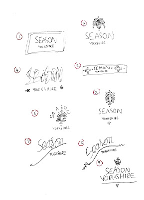
I have started to develop a Logo for Season Yorkshire through taking onboard everything the client has suggested, also taking into consideration the inspiration and current competition that she sent through (see previous blog post). I started with sketching some initial ideas.

Main points to consider for the Logo:

  • Play around with the sizing of the 'Yorkshire' in 'Season Yorkshire'.
  • Play around with the current colour palette used as it represents the colours of the spices. Start off purely black and white and then develop the chosen logo using the colours.
  • Add a hint of Pakistani/Middle eastern culture within the logo somewhere, as that is where the spice recipes and cook book are based on, but an overall modern aesthetic. Use details from the print that she had created herself.
  • Sans Serif typeface as it is more modern, the inspiration Arooj also sent through mainly consisted of minimal Sans Serif typefaces.

Initial Ideas

Using these initial ideas, I then started to create some designs for the Logo on Illustrator.

The illustrations/patterns below are details picked out from the print that Arooj provided which she had created herself. She mentioned that she wanted some details of it within the logo, which is good because the full print was very complicated and wouldn't be appropriate for a logo. I picked out shapes and illustrative parts from the print which I found interesting which also reflect the middle eastern, minimal vibe that she is wanting.

Details picked out from original print

Further developed Logos:

Trying out different Sans Serif typefaces

I then started to incorporate the patterns and details with the text. When considering layout and shapes, I also looked back at the inspiration and current competition. The overall aesthetic for the Logo aims to be modern and minimal, with a hint of middle eastern culture with the detailing.


Experimenting with the different illustrative details/icons
alongside the text

Slightly different approach, using icons relating to spices

I then sent all of these designs to the client so that she can give me feedback on which designs she'd like me to develop further and start adding colour into:


Wednesday, 5 June 2019

Designing a Logo for Season Yorkshire

I have been commissioned by a local spice company called Season Yorkshire to design a logo for the company, which was networked through a family friend. Season Yorkshire provide hand blended, authentic spices as well as a sell out cook book. The website: https://seasonyorkshire.bigcartel.com/products

Additionally, Arooj (one of the two managers of Season Yorkshire) has a background in photography which means that I could possibly have the opportunity to collaborate with her in the future which would be great.

The first messages:


In the email that Arooj sent, she provided me with some examples and inspiration of how she'd like it to look and things to possibly consider. She also sent me through their current branding and current competition for spice kits.

Current branding:

Current Logo


Inspiration:


Competition:


When discussing with her further about what she'd like in the logo, in terms of things to incorporate, aesthetic, sizing and text:
  • Play around with the sizing of the 'Yorkshire' in 'Season Yorkshire'.
  • I also mentioned that I thought the current colour palette worked well as it is similar colours to the actual spices and whether she'd like me to use colour within the logo or keep it monochrome- she mentioned to play around with whatever I feel looks appropriate which was great.
  • She mentioned that she wants a hint of Pakistani/Middle eastern culture within the logo somewhere, as that is where the spice recipes and cook book are based on, but an overall modern aesthetic.
  • The inspiration she sent focus on Sans Serif typefaces- which is appropriate as it is current and modern.
Arooj also sent me through a print that she had created herself which she would like incorporated into the logo somewhere: